How to maximise fundraising appeals, giving days and website donations | Making design, messaging and appeal templates work for your charity and supporters.
Who’s got time to create appeals from the ground up?
Not you.
You’re all about the ready-made templates that get your campaigns up and running STAT.
We get that.
That’s why we’ve just launched a new appeal template to keep things easy breezy for customers like you.
But first!
A quick look into appeals and giving days, how they’re performing and why it was time for us to freshen up the Raisely template.
What are appeals and Giving Days?
We could talk about this all day (believe me, sometimes we do).
But, essentially, appeal campaigns cover any broad direct request for donations from a charity.
These could include:
🌪 Disaster appeals (sadly, we’ve all seen too many of those lately)
🤲 Advocacy crowdfunding
🎄 Seasonal appeals (for example, Christmas or end of financial year)
💰 Giving Days (something like Giving Tuesday)
📑 A donation form on a charity’s website.
How do they perform?
Yes, we’re data-collecting fiends. That said, the 2021 Raisely data we’re about to delve into only covers organisations in Australia and New Zealand.
Appeal and donation form stats
Looking at fundraising appeals, Giving Days and donation form campaigns, we saw:
- The most frequent donation was $50
- On average, supporters gave $41
- Nestled in the middle of donations sat $30.
Is this consistent with your experience?
Conversion rates
As you well know, fundraising appeals don’t just happen (if only). So when you roll one out, you wanna make it count.
Set your sights on an 8% conversion rate (at least) to donors. That’s actually a pretty common benchmark across the Raisely platform.
In fact, many timely, optimised appeals will go well beyond that (we’re talking 15 to 30%and above).
Aim high, campaigners!
Know where your traffic is coming from
Why? Because conversion rates change dramatically, depending on the traffic source.
Consider this:
- 2.3% average conversion rate for traffic from Google
- 8.1% average conversion rate from direct
- 34% of all conversions come from Facebook/Instagram.
Make sure you are optimising your advertising. And remember: direct is highest.
Why did we update our appeal template?
We won’t go too deep today, but largely, it was about making it more mobile-friendly for our customers (46% have used the old template at least once, so it was important we stayed on top of trends. And the move to mobile is a big one!).
For now, we’re going on a 4-step fundraising appeal campaign ride!
Strap in, ‘cos we’re starting with…
Step 1: Landing page
A landing page that packs a punch gets better results (you can drill down even further by watching this workshop we hosted last year).
So how do you make just one page compelling enough to get people over the line?
Well, it’s a few different ingredients. But when you mix them up, throw in some thought and sprinkle with a little emotion, it’s a winning recipe.
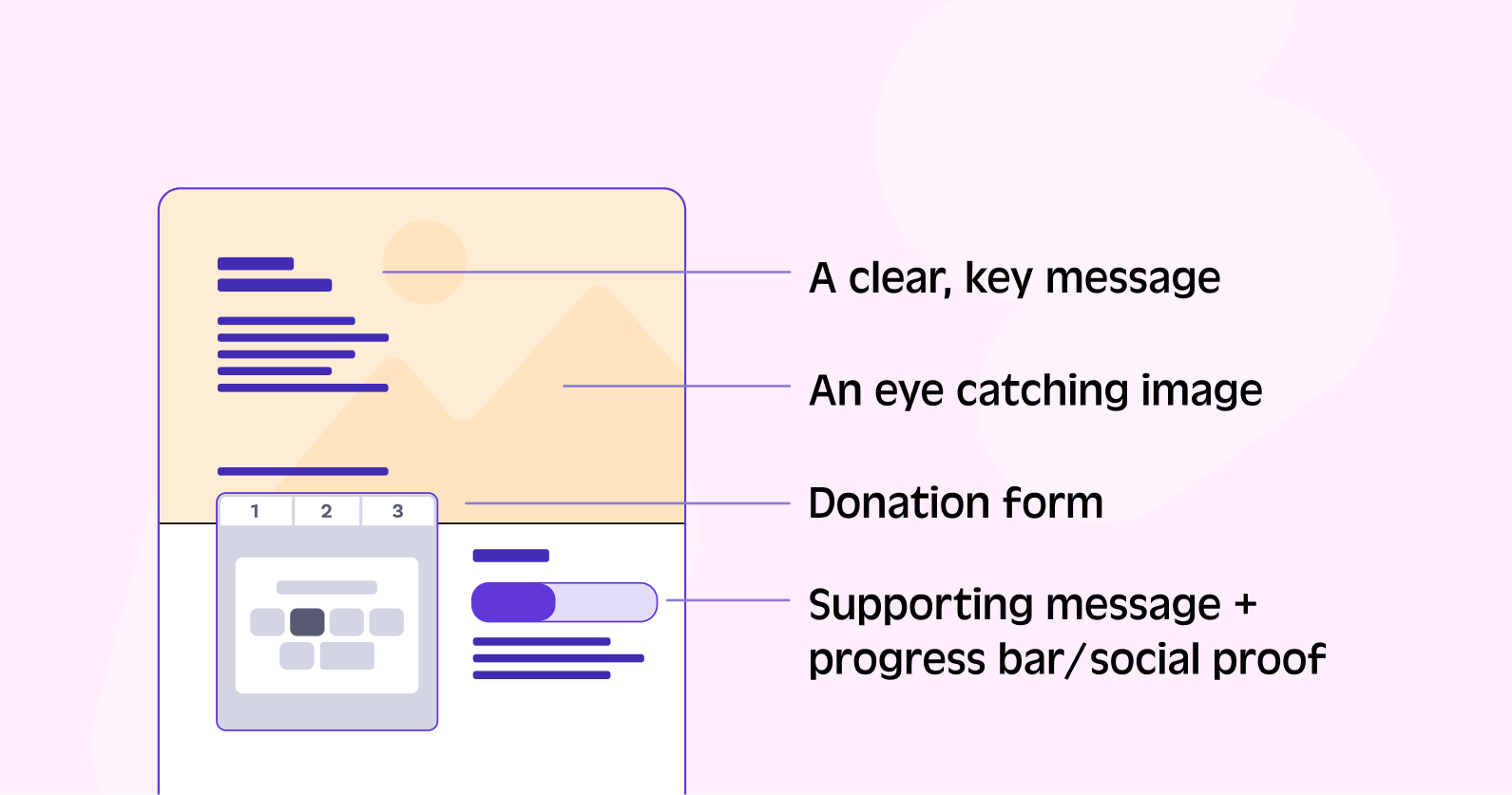
First, gather your ingredients for above the fold.

💌 A clear message
We’re talking about one crystal clear key message which is easy to read - and action.
It should be simple, short and to the point.
In other words, it needs to directly promote what you’re talking about.
📷 An eye-catching image
A picture speaks a thousand words. It can also stir up emotions, make people dig deeper and, in the end, seal the deal.
🎬 Donation form / CTA
There’s more coming later on this, but just remember to again, be super clear here.
Supporters want to know exactly how their money is helping your charity - so tell them!
Write concise, snappy messaging that tells your story.
You might even want to include dollar handles (for example, ‘$50 will feed a child for a month’ type thing) to really spell it out.
And, of course, the all-important CTA. Know exactly what you’re asking for - and ask!
📊 Supporting message + progress bar
Pop in a progress bar to give you social proof, along with a supporting message to reiterate why you’re running this fundraising appeal in the first place.
Together, these will highlight the common goal fundraisers are working towards and once more, show donors what their contribution means for your cause.
Now, you’re going to mix those ingredients up with some clever design.
👁 The Z Pattern
This is a nifty little design trick for landing pages.
In Western cultures, the Z Pattern is the natural way our eyes scan pages (left-to-right and up-to-down). It lets your supporters easily read the ‘story’ you’re telling, as it goes down the page.
Try laying out your landing page something like the example below. It’s a good foundation to work from, even if you end up playing around with it down the track.

But what about the rest of the appeal page? Let's dive into below the fold.
✍️ Tell a story down the page
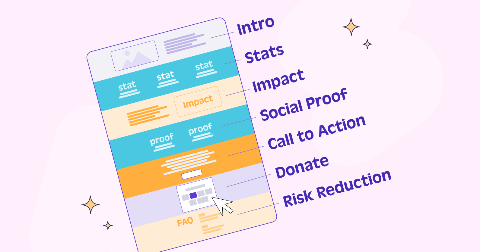
We need to tell a narrative. Here’s a formula for an appeal page where you can swap ingredients or change the order. This is a good foundation to start with to get your audience to keep scrolling.

Intro
Story of your organisation and the purpose of the appeal.
Stats
Back your appeal up with some statistics about the cause to build trust.
Impact
Communicate the impact the donor can have with a resolution.
Social Proof
Back it up again with some social proof, showing others who are participating through testimonials, donor messages or a progress bar.
Call to Action
A call to action to engage and respond to the appeal.
Donate
Provide another opportunity to convert with a secondary donation form.
Risk Reduction
Final chance to convert and address any concerns with FAQs, sponsor logos and links to any additional info about your charity.
Piece of cake, huh?
Now, here are some bonus goodies where we get into the nitty gritty both on and off your page to really make the appeal a success!
Step 2: Donation form
Donation forms aren’t big. But you can still make them user-friendly, appealing and effective.
Keep these tips top of mind:
Link to a payment account
Don’t lose your supporters at the final (financial) hurdle.
Make sure you’ve got payment options that suit your crowd.
Raisely lets you link to Stripe, PayPal, GooglePay and ApplePay for one-click donations, for example ( you can read more about payment processing types here).
Dollar handles are dandy
We touched on this before, but it’s about attaching real, tangible meaning to donation amounts.
By including descriptions or titles to your donation amounts (or dollar handles), supporters know exactly how they’re impacting your charity.
And, frankly, that feels good.
Choice is good
Give your supporters the chance to become regular givers by making it an easy option on the donation form.
And, when it comes to how much and how often they donate, give them a whole lotta choice.
Raisely has plenty of giving period options - weekly, monthly, 4-weekly, quarterly and yearly.
People can pick what suits them. We don’t mind!
Data is king
Data is powerful - but you gotta ask for it first!
So, figure out exactly what info you want from supporters. Then, customise your fields on your donation form to capture it.
Once again, the possibilities are endless on Raisely.
You might opt for a field your fundraisers or donors complete. Or perhaps a hidden field to help you segment and better understand your audience.
Whatever you choose, you can create a wide range of reports on our platform. And it’s that data which will help improve your campaigns and, ultimately, make a bigger impact.
Step 3: Automated messages
The secret here is to drop into your donors’ inbox at juuuuust the right time. The friendly neighbour who isn’t nosey so much as…there to help.
Of course, it’s not only about getting the timing right.
You’ll also want to craft custom emails and SMS messages that keep your campaign (and cause) top of mind. This will help your supporters stay interested, engaged and excited.
Make sure you:
- Thank donors
- Personalise messages
- Send receipts
- Provide updates on your appeal / giving day
Raisely’s in-built messages (transactional, triggered-based and journey ones) will help you stay on top of donor comms.
This is where CRM software (more on this below) comes into play.
Getting that right means you’ll have all the critical information you need to take your donors on a journey where they feel seen, appreciated and part of your organisation.
There’s really no excuse!
Step 4: CRM / Database
If you capture it, you can use it (great news).
But you have to manage it, too (sounds harder).
It doesn’t have to be.
Using effective CRM software helps you easily and securely store your donors’ data.
Raisely has built-in CRM tools to help you manage your supporters.
Or you can use Raisely Report Builder to import, export and sync data with your existing CRM software.
Want to know how it all works?
Check out these case studies on UNICEF, The Alfred Foundation and Breast Cancer Care.
They all integrate their Raisely platform with Salesforce - and they love it.
Trust us: it pays to get that part right.
So, if you’re stumbling around your CRM situation, have a look at this blog. It’s all about how to choose and use the right CRM software for your organisation.
Most helpful!
The appeal of appeals
The beauty of fundraising appeals is their simplicity.
It doesn’t matter whether you’re organising a day of giving, a fundraising appeal or everyday website donations.
Because, really, it all comes down to the 4 steps we’ve outlined above.
Want to know more about what Raisely’s platform can do for your organisation?
Book a demo with us!


