When it comes to fundraising, understanding how to measure and optimise your conversion rate is key. Here are nine tips nonprofits can use to increase donations.
For most nonprofits, the internet changed everything exactly the same way e-commerce changed retail. By creating a simple website, a small nonprofit organisation suddenly has the potential to accept more donations in a short time than ever before.
It’s fast and easy to receive gifts online. The trick is motivating people to give — and follow through with the entire process — credit card information included.
Between millennials, Gen X, and boomers, 55% of people worldwide prefer to give online, so optimising your nonprofit’s website and online donation pages makes a big difference. Think about how many potential donors visit your website every month. Do you know how many of them leave before they make a donation? (Say it ain’t so!) There’s one metric that tells you exactly how many gifts are coming in through your website, and that’s your page conversion rate.
Depending on how compelling you can make your appeal, it might be easier to gain more individual donations, higher donation amounts, or both. Assuming you’ve already got a great cause and an audience that cares, there are a few things you can do on your donation page itself to get more conversions (donations). This is known as the art and science of conversion rate optimisation (CRO).
If it’s more donors you’re after, you’re in luck! Keep reading for our very best fundraising conversion rate optimisation best practices.
What’s a Conversion Rate?
Conversion is just one step in the donor acquisition cycle: attract, engage, convert. The first steps of attracting and engaging might happen on social media as part of a digital strategy, or they might happen at an in-person fundraising event or elsewhere. Online donors come from various sources, and some people might even use other methods to make larger gifts.
Your website’s rate of conversion tells you what percentage of website visitors typically make a donation (or take another desired action) during a given amount of time.
Technically, for a campaign focused on growing your email list, “conversion” might mean an email subscription. Some things your conversion rate doesn’t account for are how large those gifts are or how often individual donors are sending gifts. It’s about quantity, in this case, not quality.
Conversion Rate Formula
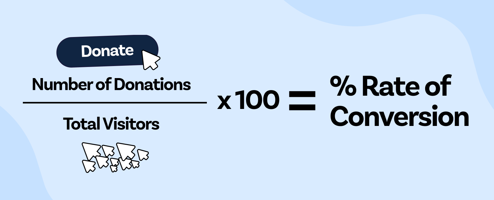
Here’s how to figure out your conversion rate: For a specific period of time, divide the number of people who made a donation through your landing page by the total number of visitors to that page. Multiply by 100 to get a clean percentage.
The formula looks like this: Number of donations / Total visitors x 100 = Rate of conversion
If you received 37 donations from 200 website visitors in a month, that would look something like this: 37 donations / 200 visitors = 0.185 or 18.5%. That’s a pretty good rate of conversion!
Conversion Rate Benchmark
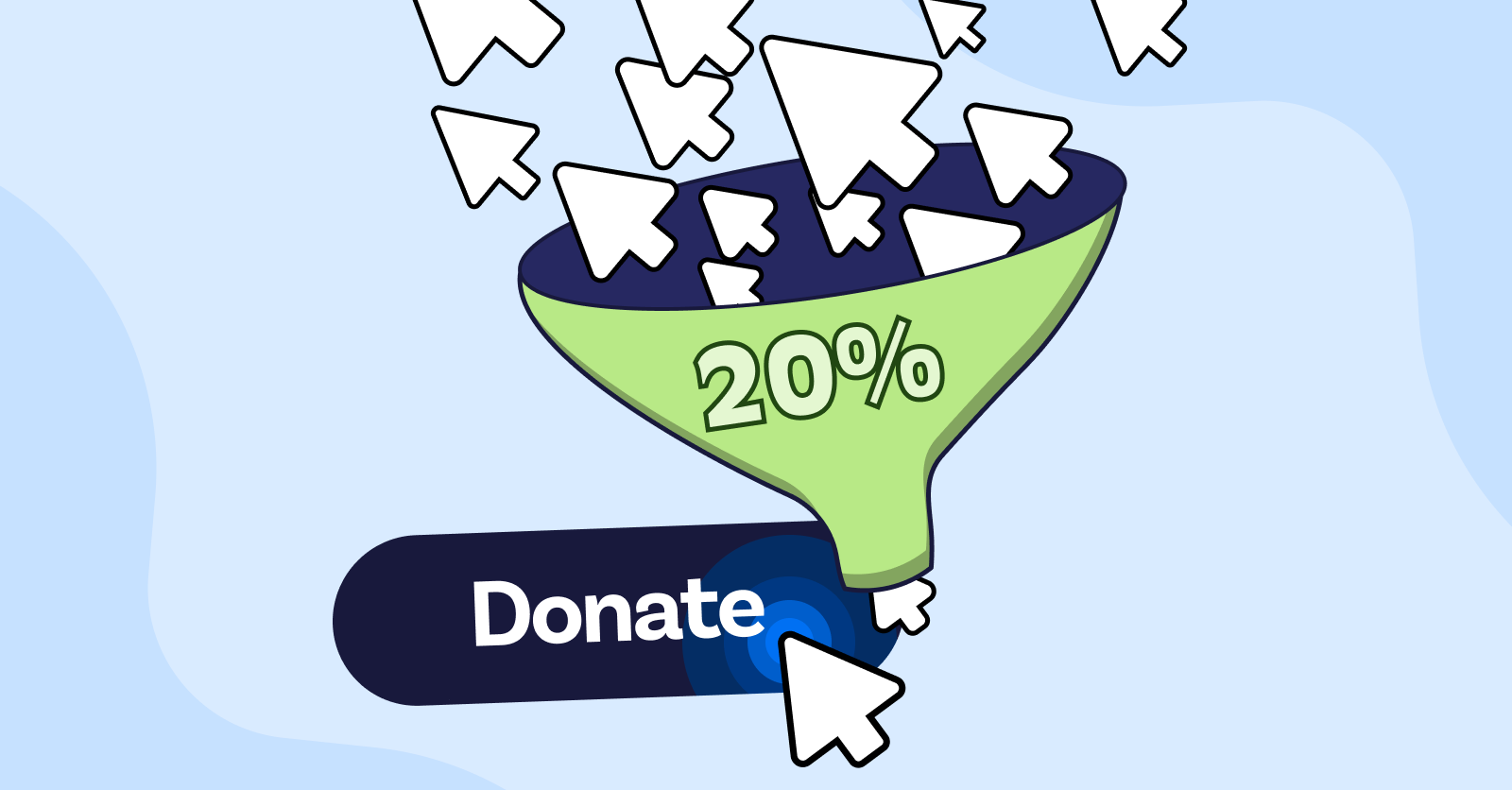
In 2021, a few studies found the average nonprofit conversion rate was around 17%. However, on Raisely we see it is slightly higher at 20%. Raisely bakes conversion rate optimisation techniques into donation forms and campaign templates, that's why our benchmark is higher.
Don’t be discouraged if you start measuring your conversion rate and it’s lower than 17% or 20%! Average sales conversion rates for business sites are much lower, below 5% in many cases. So many factors affect this number, there’s a lot of variation from one organisation’s conversion rate to another. Just find your starting point and focus on what you can do to bring it up from there.
Why Should Nonprofits Measure Fundraising Conversions?
Finding your baseline conversion rate, or your main donation page’s typical performance, can help you measure how different things increase or decrease the number of donations coming in.
It’s something you’ll want to measure each month so you can get a sense of how it changes throughout your yearly online fundraising cycles. You can compare that baseline number to your conversion rate during specific campaigns or via specific donation forms, and you can even create alternate donation pages to A/B test different features.
A/B testing is the practice of creating two different versions of something to see which version is more effective; it’s usually best to test one thing at a time, such as a headline, image, or the shape and colour of a button. Whichever version gets the highest conversion rate during a specific amount of time wins!
Your baseline conversion rate will help you reap all the benefits of your marketing work. You might find that using certain promotional channels with a higher conversion rate brings down your donor acquisition cost. Each scenario you test can potentially make it easier for people to go from fans to supporters.
Remember, your community can find you via social media, direct outreach, PR, and other outlets — and fundraising conversion rate optimisation best practices are just one way to convert the traffic you get to your donation page.
Here’s an example of how your A/B test could look like:
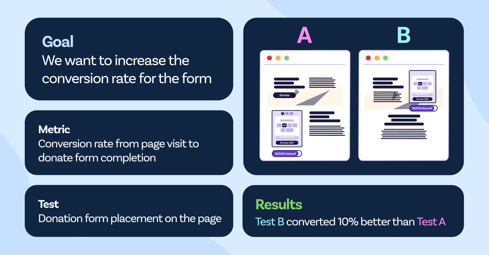
1. Define your goal
2. Choose the right metric
3. Decide which elements of the donation form to test
4. Create a control version of the donation form and a variation that changes one element at a time.
4. Determine the minimum sample size required to detect a significant difference in conversion rate.
5. Run the test by randomly dividing your audience into two groups and direct each group to the control or variation form.
6. Monitor the results of the A/B test to determine which version performed better.
7. Implement the winning version
8. Repeat the process to continually improve your donation form and increase conversion rates.
The Not-So-Secret Key to High Fundraising Conversion Rates
You can design the most visually beautiful and functional fundraising page ever, but it won’t convert unless you connect with your supporters’ reasons for giving and make them feel rewarded. With a high-enough reward and low-enough minimum gift, your landing page doesn’t have to work very hard: People will participate as soon as they hear the deal.
But there’s a bit more to it than that: First, you have to set your donor up to feel rewarded, and then you have to deliver that feeling. Show it in a visual way or make an experience out of it — something as small as a poof of digital confetti or adding their name to a list of donors on your website does the trick. The better the reward, the more repeat donors you’ll attract.
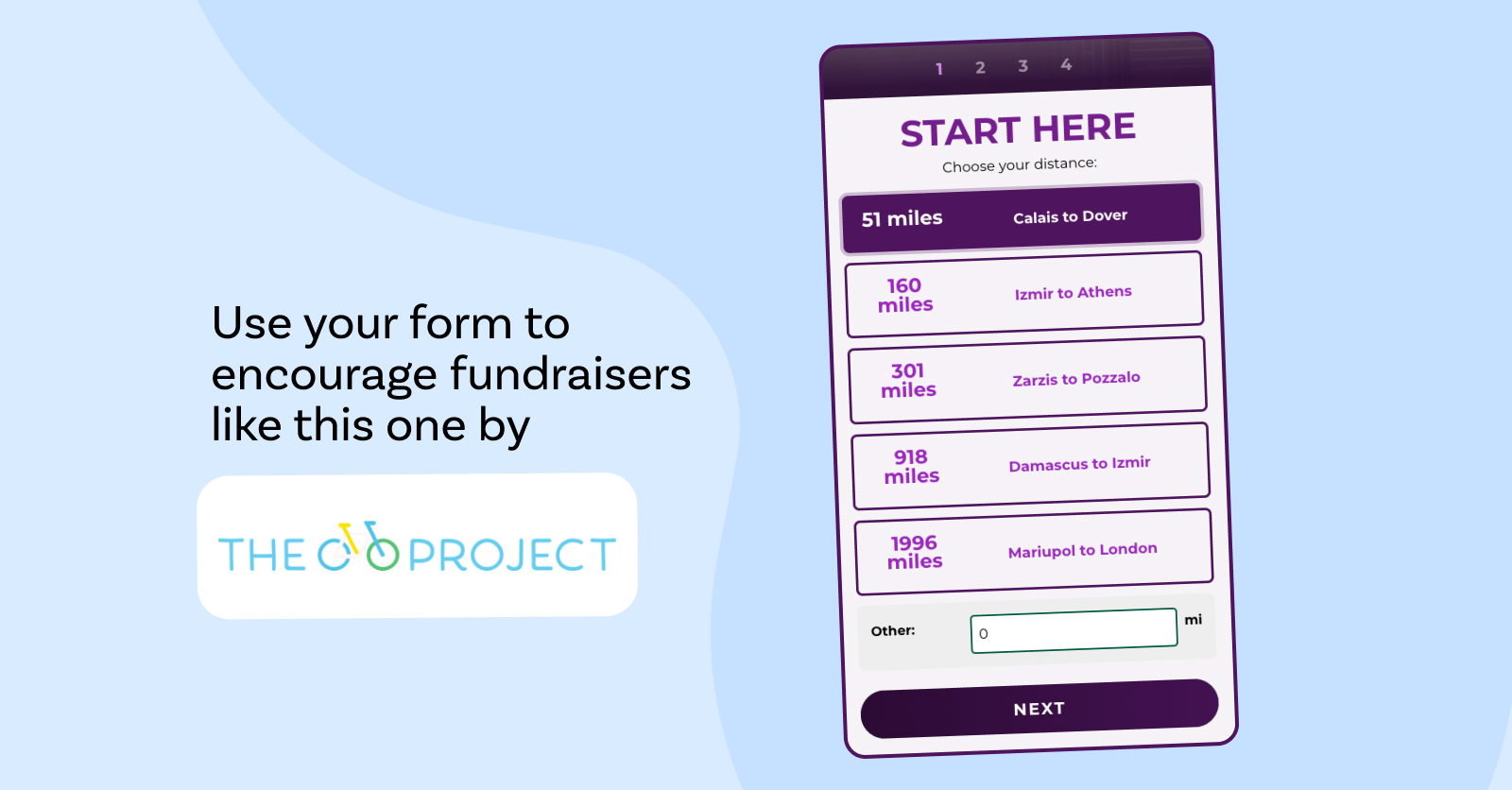
The Bike Project goes a long way to show supporters their impact when they choose specific distances for fundraising rides. Their donation page shows what different donation amounts equate to a refugee's journey to safety. The meaning attached to these donation amounts is really motivating!
They also share the story of a refugee or asylum seeker and the route they took to freedom after successful fundraising rides. Since The Bike Project mostly runs on peer-to-peer campaigns, providing detailed information about people The Bike Project has served not only encourages volunteer fundraisers to complete multiple rides, it also gives them stories to share with the supporters they attract.
Fundraising Conversion Rate Optimisation Best Practices
Ultimately, the aim of fundraising conversion rate optimisation best practices is to reduce friction in your donation process. Make it as easy to give — in as few steps — as possible. You might have some good educated guesses about what will work best and why, but as you’ll see, testing those hypotheses is the only reliable way to get proof that your donation page is functioning at its highest potential.
When you’re ready for the next level of analysis and optimisation, conversion tracking helps you find out where your web traffic is coming from.
You’ll learn over time what works best with your audience, but these tips are the best place to start.
1. Design With User Experience in Mind
Successfully converting visitors to donors means convincing, compelling, or motivating them to make a financial gift. You’re essentially helping them make the important decision to support your cause and your organisation. You might speak to the things your potential donors already care about or educate them a bit about something that needs their attention.
Use all of your design tools and assets to create an experience that’s engaging, interactive, and emotional. Show potential supporters how their action will make a difference and make them feel like a partner. Use powerful visuals and impactful statistics and language to make your appeal, and then optimise your donation form for a fast, easy checkout.
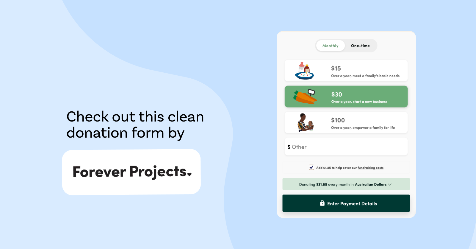
Forever Projects is an example of a donation form that was designed with the user experience in mind. Their dollar handles attach meaning to each donation amount, by communicating the impact which is really motivating for potential donors!
2. Make Clear, Compelling Calls to Action
Planning limited fundraising campaigns, such as appeals or giving days, is an effective strategy because it creates urgency: Give during this specific time frame to support a specific project, take advantage of matched giving, or get a reward. Calls to action (CTAs) on fundraising pages are the directions that urge your visitors to do something. You’d be surprised how much of a difference just a few words can make.
Most of the time, something simple like “Donate Now” or “Support [blank] Now” will do the trick. Experiment with CTAs that are concise, urgent, engaging, and interesting. “Take Action” or “Join the Fight” might get better results, depending on the situation.
3. Streamline to Make Giving a Breeze
The more steps you have in your donation process, the more opportunities potential supporters have to get distracted or otherwise decide to give up and do something else. Reduce it to the smallest number of steps while presenting other options like monthly giving if you can.
Digital wallets have made the payment process easier than ever, so depending on your supporters’ preferences, it might be worth exploring those options.
Streamlining your donation process is all about balancing enough options for how much, when, and how supporters would like to pay with simplicity and ease. Raisely donation forms have everything pared down to the most basic choices: Potential supporters can give in just three clicks.
Ready to create your
next campaign?
4. Test Everything, Then Test Again
Did you think we were done talking about A/B testing? Think again!
Any time you adjust the donor journey, watch your conversion rate to make sure it stays the same or increases from the starting point.
Test things like your call to action and the shape and colour of your donation button. Test everything on your landing page, from suggested donation amounts to content such as images and videos, and where different elements are placed.
What forms get the most engagement as a pop-up form? What forms work better at a specific place on the page? Should your donation form live on your homepage or does it need its own landing page?
Try testing different versions of your donation form and page for various audiences and platforms or tweak just one thing at a time. Here’s a list of elements you can test once you know your average conversion rate:
- Headline copy, images, and other design elements
- Call to action wording
- CTA button colour, shape, and placement
- Donation amounts
- Ways to take action: donations, peer-to-peer campaigns, and event tickets
5. Answer Supporters’ Questions Upfront
This is related to creating a donor-focused experience. Some donors will have a few questions, and they’ll poke around your website to find answers before they decide to donate. For example, they might want to know if a percentage of their donation goes to administrative costs or whether their payment information is secure. Don’t leave them hanging! Forever Projects is again a great example of what to do!
Find out what your potential donors want to know and make sure they have all the information they need to make their decision. There are plenty of places on your website to answer questions. The main things (who you are, your mission, and current campaign details) should be obvious on your homepage, and an FAQ page is a great spot to put more mundane details like how your payment processor works.
You could also tell a deeper story on your About page and use blog posts to answer more timely questions, such as why it’s important to give during the holiday season.
6. Optimise for Mobile Giving
For nonprofit organisations on Raisely, 65% of donations come in through mobile devices. That’s a huge segment of your supporters! If your landing page doesn’t look its best on mobile devices, you might be missing out on a lot of fundraising revenue.
Make sure your website is responsive — which means it can change its dimensions based on the device a user is using to view it — so it loads quickly and looks good on any kind of device, especially smartphones. While you can create mobile-responsive sites with custom coding, it’s much easier to find a platform that will do it for you! Raisely’s sites do this automatically, so you don’t need to be a developer to create a responsive site.

7. Offer Multiple Payment Options
Every potential donor will have different credit cards, bank accounts, and other payment methods they prefer. You’ll convert more people if you can accept at least one form of payment they use. However, it bears repeating: Too many choices can discourage would-be donors from finishing the process, especially if they’re not easy to navigate.
It’s a good idea to accept all major credit cards and test a few other options like PayPal, Apple Pay, Google Pay, and other mobile wallets. If you can make it easy to opt in for regular giving (whether monthly, weekly, etc.), make sure that’s on your landing page too!
Forever Projects has done it yet again by making monthly donations a default option in their donation form. Also, by not adding other frequency options, they are reducing decision fatigue and increasing the chances of converting a recurring donation.
Raisely’s Express Donations allows donors to complete a donation in just one click. Their name, email, and other personal information are automatically connected from their digital wallet, reducing the 8-10% of people who drop off on this step of the donation form.
8. Link Your Donation Page in All the Right Places
Once your donation form and page are set up and optimised, it’s time to get more traffic from high-converting sources. At the very least, make sure it’s linked on your social media profile pages or bios and in your staff’s email footers. Ask influential partners to share it through their social media profiles and try promoting it with ads.
If you’re using a lot of different content and campaigns to bring people to your donation page, conversion tracking might help you get more insight on what’s working. With Raisely’s Google Analytics integration, you can compare which keywords, ads, and campaigns are bringing in the most donations. You can also use conversion tracking to understand what’s driving other behaviours, like email subscriptions or downloads.
One of the most critical places to link your donation page is on your own website, particularly as a call to action on pages about your impact or in blog posts. Use Google Analytics to see which pages people are spending the most time on and make sure there’s an exciting call to action with a link to your donation form. Better yet, embed your donation form on your website in multiple places to avoid an additional click to a new page!
9. Re-Engage Past Donors
If someone has already made the decision to donate to your cause, it should be much easier to convince them to give again! Past donors won’t require as much education or persuasion as people who are just hearing about your nonprofit organisation for the first time. Plus, it’s likely that you already know a little something about them that you can use to get their attention aka personalisation!
Use this to your advantage to increase conversions by personalising a landing page with the name of the donor, or even suggest a donation amount that's appropriate for that segment.
How personal can you get? Why not start here (1/4)
Don’t underestimate the power of reaching out to past donors to re-engage them! Email is one of the most effective ways to do this, and you can use donor retention strategies to keep monthly donations flowing.
Send out a regular newsletter and choose a couple of key times each year to send targeted appeals. You may be able to turn past supporters into monthly donors or volunteer fundraisers in your next peer-to-peer campaign.
Raisely’s Conversion Rate Optimisation (CRO) Tools
Everything we’ve discussed in this article so far can be done using Raisely’s simple donation form builder and our suite of marketing tools, built-in CRM, and long list of integrations.
You can run a report to gather information on all transactions (donations and tickets purchased) across all campaigns for a certain amount of time or specific ones. You can also schedule reports to run every month or whenever you need them so you don’t have to remember to do it yourself!
When your design tools are simple enough for your team to handle in-house, you have a lot more freedom to try new things and see what works best. Outsourcing things like your website to professional designers and developers can be expensive, and they might not be able to run the tests you want or provide you with relevant user data.
Raisely is your all-in-one platform for agile fundraising and conversion rate excellence!
Optimise Your Fundraising Conversion Rate With Raisely
Fundraising conversion rate optimisation best practices are things you’ll look at when you initially create your donation form and landing page, and then you should revisit them regularly. Track your conversion rate long enough to get a baseline or benchmark for your typical performance and then measure it again whenever you make any big changes to your user journey or run new campaigns.
Is all this talk about fundraising page optimisation getting you excited? Create your free account and start building a better donation page for higher conversions today!
Ready to create your
next campaign?

Kelsey Hoff is a content marketing specialist, freelance writer, blogger, and poet. She creates emotionally intelligent content that “listens first” for effective, ethical thought leadership.

